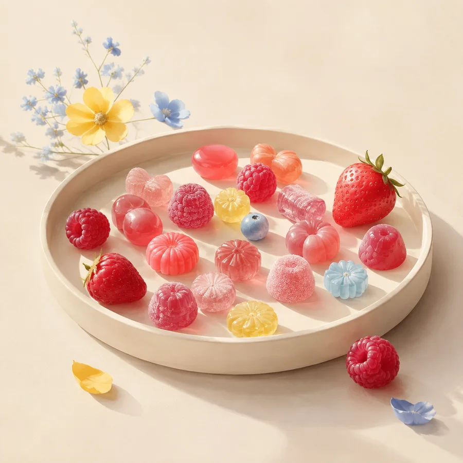
A pastel palette succeeds when the colors are soft but their roles are clear. Instead of giving every hue equal space, begin with a neutral field, select one dominant family, and reserve the brightest note for a small point of emphasis.
Start with the surface beneath the dessert
The background changes every color placed on it. Warm cream supports blush and yellow without the glare of pure white, while a cooler pale blue can make warm icing appear more saturated. Photograph the empty plate, board or paper under the intended light before matching decorations.
A neutral is still a color decision. Wood grain, gray stone and white ceramic each introduce a different temperature and amount of contrast. Keep the field quieter than the decorated object unless the setting itself is the subject of the story.
Assign color roles
Choose a dominant color, a supporting color and an accent. A blush cupcake can carry most of the visual weight, a turquoise plate can provide a cool counterpoint, and a narrow lemon detail can direct attention to the top. The useful principle is hierarchy, not a universal percentage.
Repeat the accent in one or two smaller places so it feels intentional. Equal areas of pink, yellow and turquoise often compete, especially when sprinkles and candy patterns add more local contrast.
Use value to keep pastels legible
Pastel colors sit relatively close to white, so differences in lightness can disappear on screen or in bright photography. Make a grayscale preview: if the focal object and background merge, darken a supporting surface, strengthen one edge or simplify the surrounding props.
Text requires a stricter standard than decoration. W3C guidance calls for sufficient contrast between text and its background. Candy & Color therefore keeps body copy graphite and uses pastels in images, large fields and non-text accents rather than in faint paragraphs.
Record what the palette does not prove
Pink does not establish strawberry flavor, and yellow does not prove lemon content. The FDA explains that ingredients and major allergens belong in current product labelling. A styled scene can communicate a visual theme, but it cannot replace the package or the maker’s information.
Our illustration is explicitly conceptual. It demonstrates color balance and surface contrast without claiming a recipe, a completed commission, a tasting or the availability of any pictured object.
Working takeaway
Choose the neutral first, assign each pastel a role, check value contrast and keep color separate from claims about ingredients or flavor.
Sources and scope
These references support the stated factual frame. They do not endorse Candy & Color or its illustrations.
- U.S. Food and Drug AdministrationFood Allergies
Ingredient and major-allergen labelling context for packaged foods in the United States.
- U.S. Food and Drug AdministrationTypes of Food Ingredients
How ingredient lists and certain color or flavor terms appear on labels.
- W3C Web Accessibility InitiativeUnderstanding SC 1.4.3: Contrast (Minimum)
Why readable text needs sufficient contrast from its background.